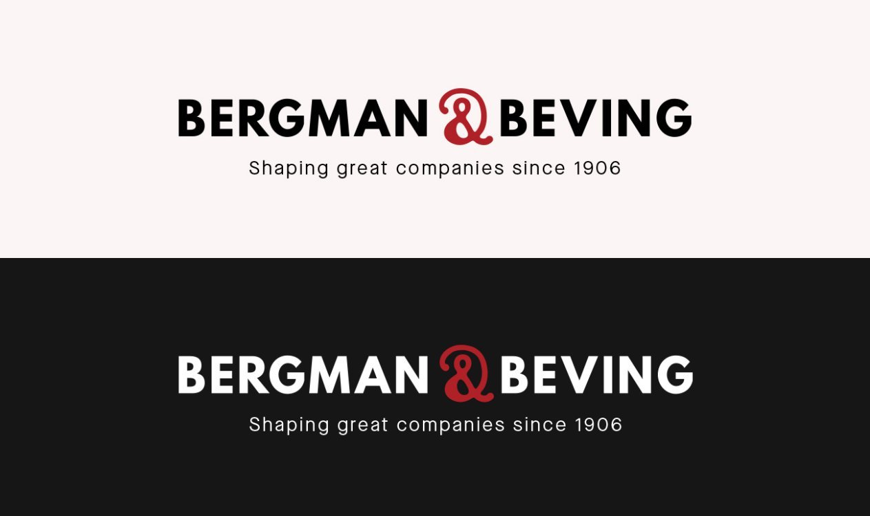


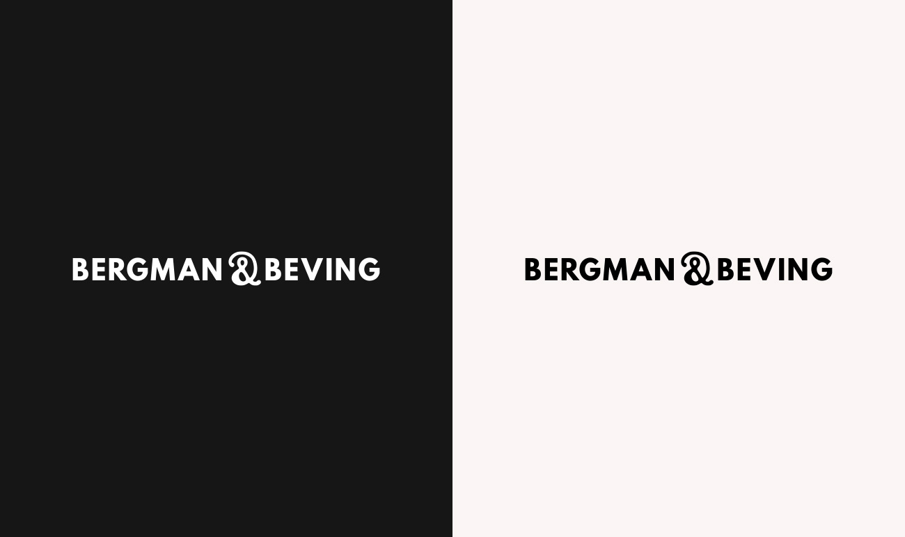
Primary logotype
The primary logotype should always be your first choice when visually representing Bergman & Beving. Only use the one-coloured black and white versions when there is poor visability for the red &-symbol.

Primary logotype - white text version. Use on dark backgrounds.
Primary logotype - black text version. Use on bright backgrounds.
Primary logotype - one coloured versions.
Tagline logotype
Our tagline logotype "Shaping great companies since 1906" is only used for printed materials and digital displays where the tagline is highly visual and legible.